Sep 21, 2025·7 min
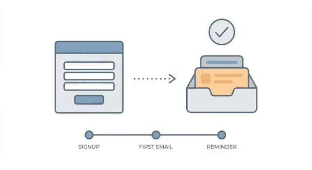
Double opt-in email without killing conversions: copy and timing
Improve list quality without losing signups using double opt-in email tactics: better copy, smart timing, resend rules, and simple checks to reduce drop-off.
Why double opt-in can hurt conversions (and where it breaks)
Double opt-in adds a second step, so some drop-off is normal. People get distracted, the message lands in spam, or they simply don’t feel enough urgency to click. The upside is list quality: fewer fake signups, fewer typos, and fewer addresses that bounce later.
“Quality” is simple: real, reachable addresses that can receive mail, not just more rows in a table. That usually leads to better deliverability and fewer headaches when you start sending onboarding or newsletters.
Most conversion losses happen at predictable breakpoints:
- Right after signup: the user isn’t sure what happens next, so they leave.
- In the inbox: the email is delayed, filtered, or hard to spot.
- At the click: the call to action is unclear, or the page after the click feels broken.
- On mobile: tiny buttons, long subject lines, and slow load times kill intent.
A common scenario: someone signs up on their phone while commuting. They expect to start immediately, but the confirmation email arrives five minutes later. By then, they’ve switched apps. If the subject looks generic and the button is buried, they never come back.
Double opt-in doesn’t have to crush your signup conversion rate. Small changes add up: faster sending, clearer copy, and fewer surprises on the screen after signup. Also, if you reduce obvious bad addresses before the confirmation step (like disposable domains and simple typos), you spend less effort chasing confirmations that were never going to become real users anyway.
Pick the goal and measure the right numbers
Double opt-in isn’t one thing. It can be a quality filter, a deliverability safeguard, a compliance step, or all three. If you don’t pick the main goal, you’ll judge the flow by the wrong metric and “optimize” in the wrong direction.
Write one sentence like: “We use double opt-in email to reduce fake signups without slowing real users.” That single sentence guides your copy, timing, and what you consider a pass or fail.
Next, define what “confirmed” means for your product. A click is common, but it’s not the only option. Pick one primary confirmation action so you can measure it cleanly: clicking a confirmation button, entering a one-time code, replying with a keyword (rare, but useful for high-trust lists), or completing a first in-app action after clicking (only if you can track it reliably).
Then set a confirmation window that matches signup intent. If your product is used right away (trial, dashboard, download), the best window is usually short. If people sign up “for later” (newsletter, waitlist), a longer window is fine. Decide what you’ll treat as success: confirmed within 15 minutes, within 24 hours, and within 7 days often tell different stories.
Measure a small set of numbers that explain both speed and quality:
- Confirmation rate (confirmed / signups)
- Time-to-confirm (median minutes)
- Activation after confirm (first key action within X hours)
- Bad address rate (bounces, typos, disposables)
- Complaint rate (spam reports from confirmed users)
If fake signups are a big driver, reduce them before double opt-in even starts. That keeps your confirmation metrics focused on real people, not junk traffic.
Reduce drop-off before the email is even sent
A lot of double opt-in losses happen before the confirmation email even arrives. People submit the form, then wonder: Did it work? What do I do now? If you answer those questions early, the extra step feels normal instead of annoying.
Start on the signup form. Set expectations in one short line near the button, in the same tone as the signup intent (trial, newsletter, account access). Be specific enough that the user can recognize the message in a crowded inbox.
Good details to include (pick the ones that matter): what happens next (“Check your inbox to confirm”), a subject hint (“Subject: Confirm your account”), where to look if it’s missing (“Check Promotions/Spam”), and how fast it should arrive (“Usually within 1 minute”). Keep the promise aligned with intent: “Confirm to start your free trial” reads differently than “Confirm to get weekly tips.”
After submit, the confirmation screen should do real work. A blank “Thanks” page creates anxiety and invites back-button behavior. Replace it with calm, concrete guidance and a way out if they made a mistake.
Make “Change email address” visible on that screen. People mistype emails more often than you think, especially on mobile. Don’t make them restart the whole signup.
A simple example: someone signs up for a trial at work, but their browser autofills an old address. If they hit a dead end, you lose them. If they can correct the address and resend instantly, they stay in motion.
One more quiet win: validate addresses before you send the confirmation. Catch obvious typos and disposables at the point of entry so your confirmation message is going to a real inbox.
Confirmation email copy that gets clicks
Your confirmation email has one job: get a single click. Treat everything else as noise. A good double opt-in email feels like a receipt plus one clear next step.
Start with a subject line that sounds like it belongs in a normal inbox. Skip hype and urgency. Specific and calm works well, for example: “Confirm your email to get weekly product tips” or “One more step: confirm your address for [Brand].” If you use the user’s first name, keep it subtle and only if you already captured it.
The first line should restate what they asked for in one sentence. This lowers doubt and helps people who signed up quickly on mobile: “You signed up to receive release notes and onboarding emails from us.” Then put the call to action immediately.
Keep the layout simple:
- One obvious button: “Confirm email”
- One fallback text line: “Or copy and paste this link into your browser”
- No extra menus, promos, or multiple CTAs
Add a short “why we confirm” line to reduce suspicion: “We do this to make sure it’s really you and to keep fake signups out.” This can also cut support tickets from people who think the email is phishing.
Write for thumbs. Use short paragraphs (1 to 2 lines), a big button, and plenty of whitespace. If you include any secondary info, keep it below the button.
Example body:
“Thanks for signing up for our newsletter.
Confirm your email to start receiving updates.
[Confirm email]
Why confirm? It protects your address and helps us prevent spam signups.
If the button doesn’t work, use this link: …”
Timing and resend rules that don’t feel pushy
Stop throwaway signups early
Reduce wasted confirmation sends by blocking disposable providers in real time.
Send the confirmation message immediately after signup. Not “within the hour,” not as part of a batch job. With double opt-in, attention is highest in the first minute, and it drops fast once the user switches tabs or puts the phone away.
Resends work best when they match real life: people miss the first email, then appreciate one nudge, then get annoyed by the third.
A resend cadence that feels like help
A practical default is: send right away, resend once after 10 to 20 minutes, then one last reminder 12 to 24 hours later. That covers “I didn’t see it,” “I got distracted,” and “I’ll deal with it tomorrow” without turning your brand into noise.
Keep the rules tight:
- Cap resends at 2 (3 total sends including the first)
- Stop instantly when they confirm (no delayed reminders)
- Stop after a clear timeout (often 24 to 48 hours) and let them restart from the signup form
- Don’t resend if the address obviously bounces or is malformed
- If the user asks for a new email, send one fresh message and still respect the cap
That last point matters because many “resend” requests are really typos. If you validate the address at signup (syntax, domain, MX), you avoid pointless resends to addresses that can’t work.
Match timing to your audience
For consumer apps, immediate + 10 to 20 minutes covers most confirmations. For B2B, the 12 to 24 hour reminder often performs better because people sign up between meetings and confirm later from their inbox.
If you know the user’s time zone, avoid sending the final reminder at 3 a.m. A reminder that lands at the start of their local morning can feel polite instead of pushy.
Make the post-signup screen do real work
The moment after signup is where many double opt-in flows quietly lose people. Don’t leave users staring at a generic “Check your inbox” line. Use this screen to remove confusion, fix mistakes fast, and keep the next step obvious.
Make the primary action clear and calm: “Open your inbox and confirm.” Under it, add an easy-to-find “Resend confirmation” button. Keep it available, but don’t make it the main call to action or people will mash resend instead of looking.
A small “where to look” block reduces support tickets and spam-folder losses. Keep it short and practical: check Spam/Promotions, search for the subject line, search for the sender name, refresh after a minute or two.
Also offer an alternate path that saves the signup: “Entered the wrong address? Update email and resend.” Put it on the same page so users don’t have to start over. This matters even more on mobile.
Keep messaging generic and safe. Avoid telling people whether an address exists, whether a domain is blocked, or why delivery failed. “If you don’t see it, resend or update your email” helps real users without giving hints to attackers.
What to do with users while they’re unconfirmed
Unconfirmed users are in a weird middle state: they showed intent, but you can’t trust the address yet. If you treat them like strangers, you lose good signups. If you treat them like full members, you invite abuse.
A good default is limited access with clear guardrails. Let them in enough to feel progress, but hold back anything that costs you money, creates risk, or depends on email deliverability.
Actions that are usually safe before confirmation include browsing the app, setting basic profile details, saving preferences or drafts, reading onboarding tips, and seeing a persistent “Confirm your email” banner with a resend option.
Hold these until they confirm (or until you trust them through other checks): team invites, trial activation, exports, high-volume actions, and anything that triggers lots of emails.
When to allow login before confirmation
Allow login when your product has immediate value without email, like exploring templates or building a first draft. If email is essential (password resets, alerts, invoices), keep the account gated, but still show what they’ll get after confirming.
Whatever you choose, say it upfront. The post-signup message should match what happens inside the app. Don’t promise “You’re all set” and then block everything.
What happens if they never confirm
Set a clear timeout and stick to it. A practical approach is: keep pending accounts for a short window, then archive or delete them. If you re-engage, keep it minimal (one reminder, then stop) and keep the same rules everywhere so users aren’t surprised later.
Common mistakes that quietly tank confirmation rates
Send fewer doomed confirmations
Verify domains and MX records so confirmation emails go to real inboxes.
Most confirmation drops are self-inflicted. The user did the hard part (typed their email). Then the next step feels weird, slow, or unsafe, so they stop.
One fast way to lose trust is changing who the message appears to come from. If your signup page says “Acme” but the email arrives from “[email protected]” or a new from-name they’ve never seen, many people assume it’s spam and never open it.
Another quiet killer is stuffing the message with marketing. A double opt-in email isn’t a newsletter. If the button is below a long intro, a pitch, or a pile of social links, people miss it, especially on mobile. Put the confirmation action first, then add any extras.
Be careful with urgency language. “Confirm in 10 minutes or your account is deleted” reads like phishing, even when you mean well. If there’s a real deadline, explain it in plain words and keep the tone calm.
Resends can help, but only when they feel respectful. Sending three reminders in 15 minutes trains people to ignore you. Worse, it can trigger spam filters and lower deliverability for future messages.
Finally, don’t let obvious bad addresses enter the funnel. Typos (like gmial.com) and disposable emails inflate signup counts but crush confirmation later. Catching them at entry keeps the confirmation step focused on real people.
Patterns to watch for:
- Inconsistent from-name, from-address, or sending domain
- Confirm button buried below extra content
- Scary countdown threats that look like fraud
- Too many resends, too close together
- No filtering for typos, invalid domains, or disposable emails
Fixing just one of these often lifts confirmations without changing your offer.
Quick checklist to improve double opt-in fast
Speed and clarity matter more than fancy design. Most drop-off happens because people aren’t sure what to do next, or the message lands late and gets buried.
Tighten your flow with a few practical checks:
- Set expectations on the form and the next screen. Say what will happen and what to look for in the inbox.
- Make delivery feel instant. Aim for the confirmation email to arrive within about 60 seconds.
- Match the subject to the moment. Mirror what the user just did, and avoid vague lines that look like marketing.
- Put the button where thumbs can reach it. The confirm action should be visible without scrolling on mobile.
- Use resend rules with a clear end. Cap resends, stop on confirm, and decide how long accounts can stay unconfirmed.
One small win: reduce bad addresses before you send the message. A quick validation at signup can catch typos and disposables so your confirmation email is more likely to reach a real inbox.
Example: a signup flow that keeps quality high and signups moving
Validate emails in minutes
Add RFC syntax, domain, and MX checks in a single API call.
A SaaS free trial signup gets hammered by bots and throwaway addresses. You want double opt-in for list quality, but you can’t afford a big drop in trial starts. Here’s a simple flow that keeps the bar high without feeling harsh.
- Signup form message (under the email field): “Use your real work email to start your trial. We’ll send a 1-click confirmation.”
- Confirmation screen (right after submit): “Check your inbox for ‘Confirm your trial’. It takes 10 seconds. Keep this tab open - we’ll refresh as soon as you confirm.” Include one secondary button: “Resend in 60 seconds.”
- Email #1 (sent within seconds): Subject: “Confirm your trial (1 click)”. Body: “Confirm your email to activate your trial. This helps us keep spam out. [Confirm my email]” Add one backup option: “Or paste this code: 482193”.
- Resend #1 (only if not confirmed after 2 minutes): Subject: “Still want access to your trial?” Body: “No pressure. If you do, confirm here: [Confirm my email]. If you didn’t sign up, ignore this.”
- Timeout rule: After 24 hours, mark as unconfirmed and stop resends. Cap resends at 2 total.
What changed: the copy promises a tiny effort (1 click), the screen tells users exactly what to do, and the resend timing is slow enough not to annoy people. The resend cap prevents you from hammering typo addresses and traps, and the timeout keeps your system from repeatedly emailing low-quality signups.
What to track weekly:
- Confirmation rate (submitted vs confirmed)
- Bounce rate on confirmation emails
- Trial activations from confirmed users
Next steps: test, tighten rules, and keep your list clean
Treat your double opt-in email as a small system you can tune. The fastest wins usually come from two levers: what the confirmation message says and when you resend it. Run a short test window (two weeks is plenty) and change only those two things first. If confirmations go up without a spike in complaints, keep the winners and move on.
Before you send any confirmation, reduce the number of addresses that were never going to work. Every typo, fake domain, or disposable inbox is a “lost conversion” you can prevent with a quick check at signup. That also protects your sender reputation because you send fewer messages to bad destinations.
If you want to tighten quality without adding friction, validate at the point of entry: syntax, domain, MX records, and known disposable providers. If your team needs a ready-made option, Verimail (verimail.co) is an email validation API that checks syntax, domains, MX records, and disposable providers in a single call, so you can filter obvious bad addresses before the double opt-in email is even triggered.
A simple plan that stays measurable:
- Run a 2-week A/B test where the only changes are confirmation email copy and resend timing.
- Add pre-checks at signup to catch typos and invalid domains before you send.
- Set resend caps and timeouts and keep them consistent.
- Write the rules down so product, marketing, and support give the same answer.
Keep monitoring two numbers together: confirmation rate and downstream quality (bounces, spam complaints, and engagement from confirmed users). If confirmation rate rises but quality drops, tighten validation or shorten the confirmation window. If quality is great but confirmations lag, try clearer subject lines and a slightly faster first resend.
The goal isn’t to “win” double opt-in. It’s to keep signups moving while ensuring every confirmed address is real, reachable, and worth keeping.
FAQ
Why does double opt-in usually lower signup conversions?
Some drop-off is normal because you’re asking for one more action after signup. People get distracted, the email can be delayed or filtered, or the next step isn’t clear enough to feel worth doing.
The trade-off is cleaner addresses and fewer bounces later, which often improves deliverability and reduces support issues.
Where do most people drop off in a double opt-in flow?
The biggest breakpoints are right after the form submit, when the confirmation email lands in the inbox, and at the click itself. Mobile makes all three worse because users switch apps quickly and small buttons are easy to miss.
If you fix those moments with clearer instructions and faster sending, you can recover a lot of confirmations without changing your offer.
What should I say on the signup form to reduce confusion?
Tell users exactly what will happen before they click “Sign up,” then repeat it on the post-signup screen. A simple line like “We’ll email you a 1-click confirmation (usually within 1 minute)” reduces anxiety and back-button behavior.
Also give them an obvious way to correct a typo and resend without restarting the whole signup.
What subject line and first line work best for confirmation emails?
Make it specific and recognizable, not vague or salesy. A subject like “Confirm your email to start your trial” sets context and looks like it belongs in a normal inbox.
Then, in the first line of the email, restate what they signed up for and put the confirmation button immediately after that.
How do I structure the confirmation email so people actually click?
One clear button, one purpose, and minimal extra content. Put the confirm action above anything else so it’s visible without scrolling, especially on mobile.
Add a short line explaining why you confirm (to protect the user and block fake signups) to reduce suspicion and “is this phishing?” reactions.
What resend timing feels helpful instead of annoying?
Send the first email immediately after signup. A practical resend default is one reminder after 10–20 minutes and a final reminder 12–24 hours later, then stop.
Cap it at two resends, stop instantly when they confirm, and don’t keep nudging after a clear timeout like 24–48 hours.
What should the post-signup “check your inbox” screen include?
It should answer “Did it work?” and “What do I do next?” with calm, concrete guidance. Include a resend button, a visible “Change email address” option, and a short note about checking Spam/Promotions.
Avoid sharing detailed failure reasons; keep it safe and simple so you help real users without giving attackers extra signals.
Should I let users use the product before they confirm their email?
A good default is limited access that still lets them feel progress. Let them browse, set basic preferences, or start a draft, but hold back anything risky or costly like team invites, exports, or high-volume actions.
Keep a persistent “Confirm your email” reminder inside the app so the next step is always obvious.
How do I handle mistyped emails without losing the signup?
Don’t let users get stuck because of a typo. Show the email they entered, provide a one-tap “Edit email” flow, and resend immediately after the correction.
If you also validate the address at entry, you can catch obvious typos and invalid domains before you ever send a confirmation email.
How can I reduce fake or disposable emails before double opt-in starts?
Validate at the point of entry so you block disposable domains, obvious typos, and invalid mail setups before the confirmation step. This reduces pointless resends and increases the share of confirmation emails that reach a real inbox.
If you want a simple API option, Verimail can check syntax, domain, MX records, and disposable providers in one call so you filter bad addresses before triggering double opt-in.