Oct 21, 2025·8 min
Email quality metrics to monitor over time (and why)
Email quality metrics can show where bad signups come from and what they cost. Track invalid, disposable, and domain failures and tie them to activation.
What you’re really trying to measure (in plain terms)
“Email quality” is simple: can you reach this person, and does the address look like it belongs to a real, interested user.
In a signup or lead form, a high-quality email address is one that can receive mail, isn’t disposable or temporary, and looks low-risk (not a known trap or a pattern that often leads to complaints). You’re not judging the person. You’re judging whether the address will work as a reliable channel.
When quality drops, it shows up quickly:
- More bounces, which can hurt sender reputation and deliverability
- Lower activation because users never see verification or welcome emails
- A CRM full of dead leads that waste follow-up time
- Noisy analytics (it looks like “signups are up,” but real users aren’t)
Monitoring isn’t about pretty charts. It’s about early warning and fast diagnosis. Useful metrics tell you two things: what changed, and where it came from (a campaign, traffic source, country, specific form, or a new partner).
Example: you launch a promo and signups jump 30%. A week later, fewer users activate. If you’re tracking email quality, you might see disposable addresses doubled in that window, or domain and MX failures spiked. That points to bot traffic, a broken form field, or a source that’s attracting low-intent signups.
Set expectations early: every metric should map to an action. If a number goes up, you should already know whether that means tightening validation, adjusting a campaign, adding friction for suspicious traffic, or investigating a one-off outage.
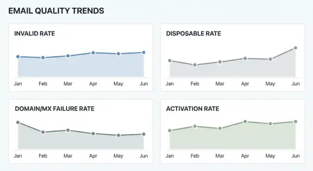
The core metrics: invalid, disposable, and domain failures
If you want metrics that stay useful over time, keep the “core three” simple and well-defined. These numbers tell you whether you’re collecting reachable addresses and whether the problem is user behavior or infrastructure.
Invalid rate is the share of signups where the address isn’t usable. At minimum, count obvious failures like bad syntax (missing @, illegal characters) and domains that don’t exist. If you also measure mailbox reachability, be careful with interpretation: “mailbox unreachable” can mean a truly invalid mailbox, but it can also be a temporary block, greylisting, or a provider limiting checks.
Disposable rate is the share of signups from known disposable email providers (one-time inbox services). These addresses often correlate with fake accounts, lower activation, higher fraud risk, and weaker deliverability later. A disposable address can still be technically “valid,” which is why this metric should stand on its own.
Domain and MX failure rate captures problems that happen before you ever reach a mailbox: the domain is missing, DNS can’t be resolved, or the domain has no MX records (so it can’t receive email). If you can, track temporary DNS failures separately, because they often spike during outages.
A practical setup uses a few stable outcome buckets. Many teams start with:
- Valid
- Invalid
- Disposable
- Unknown
The unknown bucket is your early warning system. It catches timeouts, provider blocks, and ambiguous results that shouldn’t be forced into “valid” or “invalid.” Whatever tool you use, consistency matters more than perfect categorization: keep definitions stable, and only change them with a dated note so trends stay comparable.
How to calculate the rates so they don’t lie
Good metrics start with one boring decision: pick a consistent denominator. For signup monitoring, use total signups as the base so each rate answers, “Out of everyone who tried to join, how many had this problem?”
Formulas you can reuse (per day or per week):
- Invalid email rate = invalid_results / total_signups
- Disposable email rate = disposable_results / total_signups
- Domain and MX failure rate = domain_or_mx_fail_results / total_signups
- Validation coverage rate = validated_signups / total_signups
Track counts next to rates. Rates alone can mislead when volume is small. If you had 20 signups on Sunday and 2 were invalid, that’s 10%, but it could be noise. Counts tell you whether you’re seeing a real shift.
For reporting, use both daily and weekly views. Daily helps you spot sudden changes (like a campaign launch). Weekly smooths day-to-day swings. A 7-day rolling view is a good middle ground.
Domain and DNS checks need one extra rule: retries. Sometimes a domain lookup fails because of a temporary resolver issue, not because the email is bad. Decide what you want to measure and label it clearly:
- First-attempt failure rate (catches infrastructure or DNS reliability problems fast)
- Final failure rate after retries (closer to true address reachability)
Finally, store the raw validation result code, not just pass/fail. When you keep the reason (syntax_error, no_mx, disposable_provider, blocked, timeout, and so on), you can explain changes later and segment accurately.
Step by step: set up monitoring from signup to dashboard
Start by deciding where checks happen. Many teams do a quick format check in the signup form to catch typos, then run the real decision on the server so it can’t be bypassed.
Next, log the result for every attempt, even the ones you block. Blocked attempts still tell you about attacks, broken marketing sources, and UX friction.
A simple setup that works for most products:
- Validate on signup (and on email-change flows).
- Store timestamp, user/session ID, signup source (campaign/referrer/app), and the raw email domain.
- Store the validation outcome plus a short reason code (syntax, disposable, MX missing, domain not found, blocklisted, timeout).
- Map outcomes into stable buckets you’ll keep long-term: valid, invalid, disposable, domain-fail, unknown.
- Aggregate into a daily table and chart each rate as a trend line.
Consistency is the difference between a dashboard you trust and one you ignore. Keep the core buckets stable even if your validator adds new reason codes later. You can always create a secondary breakdown, but your headline trend lines shouldn’t change definition every month.
For the dashboard, one chart per rate is enough at first. Add a small table under each chart with daily counts so you can see whether a spike is real or just low volume.
Build a weekly habit: when a spike appears, write down what changed (new campaign, new country, product copy change, new traffic source, validation config update). If disposable rate jumps right after a giveaway campaign launches, that might be expected, and the real decision is whether to block, warn, or allow but flag those signups.
Segmenting: find where bad emails actually come from
If you only track one site-wide number, you’ll miss the cause. Bad addresses are rarely evenly spread. Segmenting turns email quality metrics into something you can act on.
Start with “where did this signup come from?” and break rates down by a small set of sources you trust. A simple first pass:
- Acquisition channel (ads, SEO, partners, referrals, sales imports)
- Signup surface (waitlist, trial, newsletter, contact sales)
- Geography or language (only when volumes are large enough)
- New vs returning users (if you can tell the difference)
Keep groups big enough to mean something. A country with 12 signups can swing from 0% to 25% invalid overnight and it means nothing. Set a minimum sample size (for example, 100 signups) before you treat a segment as signal.
A practical example: you see a weekly spike in disposable email rate. The site-wide chart looks scary, but segmentation shows it’s almost entirely from one partner campaign sending traffic to a newsletter form. Now you know what to do next: review that form’s protections, adjust the campaign, or require an extra step for that path.
Also watch for bots. They tend to hit one surface hard (often the simplest form) and create sudden jumps. Clues include a sharp rise from a single referrer, very high domain and MX failure rate in one form, bursts of signups at odd hours, or traffic from geographies that don’t match your audience.
Tie email quality to activation and other downstream outcomes
Improve your quality dashboard
Validate every signup and log result codes for metrics you can trust.
Email quality isn’t only about deliverability. It changes what happens after signup: whether people finish onboarding, confirm their email, and come back. If a chunk of signups use invalid or disposable addresses, your product metrics can look worse even if the product itself didn’t change.
A practical way to see this is to track activation rate by signup cohort (each day or week) and compare cohorts with different email-quality levels. When a cohort has a higher invalid or disposable rate, check whether activation drops in that same cohort. That’s when email quality becomes a business signal, not just a mail ops detail.
Downstream outcomes worth tracking
Pick a few milestones that matter to your product, then break them out by email-quality segment (valid vs invalid, disposable vs non-disposable, domain/MX failures):
- Email verification completion rate
- First login rate within 24-72 hours
- First key action (your “aha” moment)
- Trial-to-paid (or lead-to-meeting) rate
- Support contact rate per 1,000 signups
A simple way to estimate the cost
Even rough math helps: extra support tickets, extra sales follow-ups, resend/verification overhead, plus the softer cost of bounce-driven reputation risk. If 2% more signups are invalid and each bad signup costs 3 minutes of support time, you can turn a percentage into hours and dollars fast.
One caution: correlation isn’t always causation. Seasonality, a new traffic source, or a UI change can move activation and email quality at the same time. Still, repeated patterns across cohorts are usually enough to guide what to investigate next.
Alerts and thresholds that trigger the right response
Alerts should catch real problems, not normal noise. Start by learning your baseline for the last 2 to 4 weeks: what “normal” looks like for invalid rate, disposable rate, and domain and MX failure rate. Then set thresholds that fit your traffic.
A practical rule is “2x normal,” but only when volume is high enough to matter. If disposable emails usually run at 1%, an alert at 2% can be useful, but only after at least 200 signups in the window.
Use both absolute and relative triggers so metrics don’t mislead:
- Relative spike: rate is 2x (or 1.5x) your baseline
- Absolute floor: rate is above a fixed number (for example, >3%)
- Minimum volume: at least N signups (pick N that fits your traffic)
- Minimum duration: sustained for 30 to 60 minutes (or 1 full day for low volume)
Keep separate alerts for different failure types because the owner and fix are often different. A disposable spike often points to abuse, an incentive campaign, or a bot wave. A domain/MX failure spike often points to a form bug, a bad autofill pattern, or a temporary DNS issue.
When an alert fires, write a short incident note:
- What changed (release, campaign, traffic source, country)
- Which metric moved, and by how much
- Which segment drove it (channel, form, cohort)
- What you did (blocked, adjusted UI, tightened validation)
- Outcome after the change
Decide ownership upfront. Marketing ops usually owns campaign-driven spikes, product owns form and UX issues, and engineering owns validation logic and integrations.
Reading the patterns: what each spike usually means
Keep your CRM clean
Block invalid and risky emails so your team follows up with real leads.
Week over week, the spikes are where you learn the most. They usually point to a specific cause.
Invalid rate spike often comes from form abuse (bots), simple typos, or a UI change like a broken input mask.
Quick action: check recent form changes and run a few real signups on mobile and desktop.
Deeper follow-up: compare invalids by source (landing page, device, country, campaign) and review server logs for bot-like bursts.
Disposable email rate spike is common after adding an incentive (coupon, free trial) or buying traffic. It can also signal low-intent visitors testing your product.
Quick action: tighten rules around the offer (one-time codes, rate limits, stronger bot checks).
Deeper follow-up: break disposable signups by channel and creative, then decide whether to block, warn, or require an extra step for risky segments.
Domain and MX failure rate spike often points to DNS resolution issues, a temporary outage at a major provider, or a networking change on your side.
Quick action: re-test a sample of failing domains a few minutes later and from a second network.
Deeper follow-up: check DNS resolver health and timeouts.
“Unknown” bucket growth usually means your integration is timing out, dropping fields, or not classifying a new pattern.
Quick action: verify API responses are logged and stored correctly end to end.
Deeper follow-up: audit timeouts, retries, and how you map reason codes into buckets.
A good rule: if a spike matches a product change, suspect your form first. If it matches a traffic change, suspect intent and abuse.
Common mistakes that make the metrics useless
Most dashboards fail for boring reasons: the numbers look precise, but the data is messy. Each chart should answer one clear question and stay comparable week to week.
One fast way to break your rates is to count attempts instead of people. Signups often include retries (typos, back button, resubmits, mobile timeouts). If you count every attempt, your invalid rate can jump even when the same users eventually fix their address. Decide on a unit (unique user, unique email, or unique signup session) and dedupe before calculating rates.
Another trap is changing definitions midstream. If “disposable” expands to include more providers, or “invalid” switches from syntax-only to syntax plus domain checks, your trend line will show a fake spike. Freeze definitions, version them, and keep a simple change log.
Common mistakes that poison results:
- Mixing attempts and unique signups without clear deduplication
- Quietly changing what counts as invalid or disposable, then comparing across months
- Watching only overall totals and missing the one channel that drives most bad emails
- Blocking too aggressively to raise “valid rate,” then lowering real conversions
- Treating temporary DNS timeouts as permanent failures instead of retrying or separating them
Example: a campaign brings signups from one region. DNS lookups are slower there for a few hours, so domain checks time out. If you label those as hard failures, your domain failure rate spikes and you may block good users. If you track timeouts separately and retry, the spike becomes a performance issue, not an email quality crisis.
Example: diagnosing a signup-quality drop in one week
A SaaS team notices something odd on Monday: trials are up 30% after a new promo campaign, but disposable email rate jumps from 4% to 18%. Two days later, support tickets rise because people “never got the welcome email,” and sales complains leads feel low intent.
First, confirm it’s real and not a tracking glitch. Compare last week to the previous four-week average, using the same definition and denominator. If metrics are calculated per signup attempt, changes in retry behavior can hide (or exaggerate) the problem. Decide whether you’re monitoring per attempt, per accepted signup, or per unique user, and stick to it.
Then segment to find the driver. Breaking signups down by source shows the spike is almost entirely from PromoA (a coupon posted on a deal forum). Organic and partner referrals are unchanged. Domain and MX failure rate stays flat, suggesting it isn’t a DNS outage or a form bug. It’s mostly disposable providers.
A simple root-cause check:
- Compare disposable rate by campaign, not just overall
- Check activation rate for the new cohort vs last week’s cohort
- Review a small sample of addresses (without storing more than needed)
- Confirm the system is classifying the same domains consistently
- Align on the goal: more trials, more activations, or both
Next comes the decision. They choose a staged response: block the most common disposable domains and add email verification for PromoA traffic only. The incentive stays, but abuse gets tighter.
Within a week, disposable rate drops to 6% for PromoA, activation improves from 9% to 14%, and support load returns to normal. They document a short before/after note (metrics, dates, and the exact change) so the next alert leads to a confident response.
Quick checklist for a healthy email-quality dashboard
Make unknown results visible
Capture timeouts and blocks with reason codes you can trend over time.
A good dashboard is boring most days. When something changes, you can quickly tell what changed and where it started.
Set a baseline from the last 4 to 8 weeks. It’s long enough to smooth noise, but short enough to reflect current traffic and your signup flow.
Sanity-check your setup:
- You track invalid, disposable, domain/MX failures, and unknown as separate outcomes (not one blended fail rate).
- Every chart can be split by acquisition source and by the exact entry point (web, mobile, checkout, waitlist).
- You review activation (or first key action) by signup cohort next to email-quality rates.
- Alerts require both a rate change and a minimum volume.
- You can jump from a spike to a small sample for that segment to spot patterns fast.
Assign an owner and a playbook. When disposable rate jumps, who checks campaigns? When domain failures rise, who verifies outage vs form bug?
Next steps: improve quality without hurting signups
Start with one change you can stick with. If you add logging, segmentation, and alerts all at once, you won’t know what helped.
Pick your first improvement based on the pain you feel most:
- If you argue about the numbers, improve logging first.
- If you can’t tell where problems come from, add segmentation first.
- If you keep finding issues too late, add alerts first.
Next, decide your policy for “bad” and “maybe bad” emails. Invalid and hard domain failures are usually safe to block because they rarely turn into real users. Disposable and temporary failures are trickier because some real people use them.
A simple policy that works for many products: block obvious invalids, warn on disposable, and retry temporary failures (or ask the user to confirm). Whatever you choose, write it down so support and product respond consistently.
Then run a small experiment. Change one gate for one segment for a short time, and watch both quality and outcomes. Example: show a warning (not a block) for disposable emails on mobile signups for a week, then compare activation by cohort against the prior week. If activation stays flat but disposable rate drops, keep it. If activation drops, roll it back.
If you want consistent classification at signup, an email validation API can help you label invalid, disposable, and domain/MX outcomes the same way across forms and services. For example, Verimail (verimail.co) provides a single-call validation API with checks like syntax, domain and MX verification, and disposable provider matching.
Set a monthly review that ends with a decision. One page is enough: top metrics, biggest change, what you tried, what you’ll change next month, and what you won’t change.
FAQ
What does “email quality” actually mean for signups?
Email quality means the address is likely reachable and low-risk for your product. A “good” email can receive mail, isn’t from a disposable provider, and doesn’t match patterns that often lead to bounces or complaints.
Which 3 email quality metrics should I track first?
Start with three: invalid rate, disposable rate, and domain/MX failure rate. Together they tell you whether users are making typos, whether you’re attracting low-intent signups, and whether infrastructure or DNS issues are blocking deliverability.
What should I use as the denominator when calculating rates?
Use total signup attempts as the default denominator so each rate answers “out of everyone who tried to sign up, how many had this issue?” Then keep that denominator consistent across weeks so trends stay comparable.
Why do I need an “unknown” bucket?
“Unknown” is where timeouts, provider blocks, and ambiguous checks go. It’s useful because it highlights integration problems and temporary conditions you shouldn’t quietly label as valid or invalid.
Should I retry domain/MX checks, or count failures immediately?
Because DNS and network lookups can fail temporarily even when an email is fine. A common approach is to track first-attempt failures (to catch outages fast) and final failures after a retry (to estimate true reachability).
How do I figure out where bad emails are coming from?
If you only look at one site-wide number, you’ll miss the cause. Segment by acquisition source and signup surface first, then add geography or device only when the sample size is large enough to trust the results.
How do I connect email quality to activation and other outcomes?
Track activation or verification completion by signup cohort, and compare cohorts with different email-quality levels. If cohorts with higher disposable or invalid rates consistently activate less, you’ve found a lever that affects product metrics, not just deliverability.
What thresholds should I use for alerts without getting spammed?
Set alerts based on a baseline from the last few weeks, and require enough volume to avoid noise. A practical alert triggers when a rate jumps meaningfully above normal and stays elevated long enough to rule out a brief blip.
What are the most common mistakes that make these metrics misleading?
The big one is counting attempts instead of unique signups or sessions, which inflates invalid rates when users retry. Another is changing definitions over time, which creates fake spikes; keep buckets stable and record any definition changes with dates.
Should I block disposable emails, or just warn users?
Default to blocking obvious invalids and hard domain/MX failures, since they rarely convert. Treat disposable and temporary failures more carefully by warning, adding verification, or applying extra friction only to higher-risk segments so you don’t harm legitimate conversions.