Mar 13, 2025·8 min
Email validation at signup: where to run checks for best UX
Email validation at signup: learn where to run checks (inline, on-blur, post-submit) to balance conversion, fewer errors, and cleaner user data.
The real problem: bad emails vs signup friction
A signup form has two jobs that fight each other: let real people in quickly, and keep junk data out. Push too hard on checks and you lose signups. Push too little and you collect bad emails that hurt deliverability, create fake accounts, and waste support time.
When people talk about email validation at signup, they often mix up two separate questions: what you check, and when you check it. This is about timing.
Validation timing is the moment you show feedback or block progress in the signup flow. The same rule can feel helpful or annoying depending on when it fires. Warning someone the second they type "@" is noisy. Warning them after they finish the field can be calm and clear.
There’s a three-way tradeoff to keep in mind:
- Completion rate: how many people finish the form without giving up
- Data quality: how many addresses are real, reachable, and safe to keep
- Support load: how often your team has to fix accounts, resend confirmations, or handle bounces
Optimize only for completion rate and you’ll accept typos, disposable emails, and spam traps that later harm your sender reputation. Optimize only for data quality and you can accidentally treat honest users like scammers, especially on mobile or slow connections.
Set expectations early: some checks can only happen after the user finishes typing, and some need a quick call to a validation service. Syntax checks can run locally, but things like domain verification, MX lookups, and disposable email detection usually require a server-side step. Tools like Verimail can do these checks in milliseconds, but you still need to choose the right moment to trigger them.
A simple example: someone types "[email protected]" and hits Sign up. If you wait until after submission, they may only learn about the typo after a full-page error, then retype everything. If you check at a calmer moment (like when they leave the email field), you can catch it with less frustration and fewer abandoned signups.
What you can validate (and what you cannot) during signup
Not all email checks mean the same thing. The biggest source of confusion is mixing up “does this look like an email?” with “can I actually reach this inbox?” Good UX starts with knowing which signals you can trust in the moment.
Checks you can run during signup
Some checks are instant because they only look at what the user typed. Others need a network call, which adds latency and can fail if the user’s connection is slow.
Useful layers, from simplest to strongest:
- Syntax (RFC-style) checks: catches missing @, invalid characters, double dots, and other format errors. This is immediate.
- Domain verification: confirms the domain part exists (for example, not
gmal.com). This typically requires a DNS lookup. - MX record lookup: checks whether the domain is set up to receive mail. Also a DNS lookup, and usually more meaningful than “domain exists.”
- Disposable email detection: flags addresses from known throwaway providers. This is usually a fast lookup against a blocklist.
- Spam trap and risky-address matching: warns about addresses that are likely to hurt deliverability. This is often a lookup against risk signals.
Tools like Verimail combine these into a multi-stage pipeline, but each stage still answers a different question.
What you cannot prove in a signup form
Even if an address passes syntax, domain, and MX checks, it can still be unreachable. The mailbox might not exist, it could be full, or the provider might accept mail at first and bounce later.
A quick example: [email protected] can look perfect and the domain can have MX records, but Sarah may have left the company last month. On the other hand, [email protected] might look “weird” to some basic validators, but it can be a real, reachable inbox.
The practical takeaway: treat “looks valid” as a first filter, and treat deliverability-focused checks as stronger signals, not guarantees. That mindset helps you decide when to show warnings versus when to block.
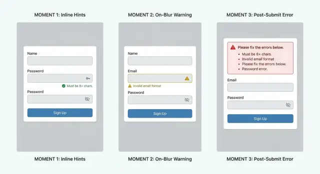
Inline validation: fast feedback, easy to overdo
Inline validation means the form reacts while someone is still typing. Done well, it feels like a helpful spellcheck. Done badly, it feels like the form is scolding you before you’ve even finished.
Inline checks that usually help:
- Trim leading and trailing spaces automatically.
- Flag obvious syntax issues like a missing @ or two @ symbols.
- Catch common domain mistakes like gmial.com or hotnail.com.
- Warn about unsupported characters that can never be part of an email.
The big risk is noise. If the field flashes red after the first few letters, users learn to ignore it or they feel rushed. A simple rule: don’t show an error until the input starts to look like an email address. For example, wait until there is an @, or until they’ve typed a few characters after it.
When you do show a message, keep it plain and specific. Avoid vague lines like “Invalid email.” Better options:
- “Add an @ sign (like [email protected]).”
- “Remove spaces from the email address.”
- “Did you mean gmail.com?”
One common scenario: someone types sara @gmail.com (with a space). Inline validation can quietly remove the extra space or show “Remove spaces” without blocking them. Save heavier checks, like domain and MX lookup or disposable email detection (for example, via Verimail), for later in the flow so you don’t punish normal typing speed.
On-blur validation: a good default for most signup forms
On-blur validation runs when the person leaves the email field (they tap away, press Tab, or move to the next input). It’s a sweet spot because it gives feedback early, but it doesn’t fight the user while they’re still typing.
This timing works best for checks that can be done quickly and with high confidence. Start with simple format rules (missing @, spaces, two @ signs). Then add lightweight domain checks, like whether the domain exists and has MX records. These catch a lot of bad addresses without making the form feel jumpy.
The main UX risk is slow checks. If you call an API after blur (for example, to detect disposable domains or known spam traps), keep the UI calm. Show a small “Checking…” message near the field and avoid blocking the next step unless you have a clear reason.
A practical pattern: let the user continue filling the form while the email check runs. If the check comes back clean, show a subtle success state (or nothing at all). If it comes back with an issue, show a clear message and keep focus on what to fix. This reduces “stop and start” frustration and helps completion rates.
When deciding between soft warnings and hard blocks, use the severity of the problem:
- Hard block: invalid format, domain does not exist, no MX records, or the address is clearly unreachable.
- Soft warning: looks risky (disposable email, role-based inbox like info@, temporary domain) but could be real.
- Soft warning: “Did you mean…” typos (gmial.com) where the user can confirm.
- Hard block: repeated failed attempts that match obvious automation patterns.
If you use a service like Verimail for deeper checks, on-blur is often a good moment to run validation in the background. Treat the result as guidance, not punishment, unless you’re confident the email is truly invalid.
One detail that matters: don’t clear the field or overwrite what they typed. Keep their input, highlight the issue, and tell them the next action in plain words (for example: “This domain can’t receive email. Try another address.”).
Post-submit validation: less noise, but higher frustration
Turn rules into better UX
Use fast validation results to decide what to block vs warn without frustrating real users.
Post-submit validation runs when the user clicks Create account, Sign up, or Continue. Until that moment, the form stays quiet, which can feel clean and calm.
This approach works well when you want to run a full validation pass at once, especially if you’re doing more than a quick format check. A deeper pass might include syntax rules, domain checks, MX records, and disposable email detection.
The big risk is frustration: the user thinks they’re done, then gets blocked and has to hunt for the problem. If the error message is vague (like “Invalid input”), people may give up instead of fixing it.
How to make post-submit validation workable
Post-submit can still feel fair if you design the failure state carefully:
- Show one clear summary at the top, then scroll to the first problem field.
- Put focus in the field that needs fixing, and highlight it clearly.
- Keep every value the user entered (never wipe the form).
- Explain what to do in plain words (“Use a work or personal inbox, not a temporary email”).
- If a check takes time, show a short progress state so it doesn’t look broken.
Example: someone enters [email protected], fills a password, and clicks Create account. If your system flags the address as disposable (using a real-time API like Verimail), the page should return them to the email field with the address still filled in, explain why it’s not allowed, and let them correct it in seconds.
When post-submit is a good fit
Post-submit is more acceptable when users already expect a review step, such as:
- Multi-field forms (billing details, company info)
- Step-based signup flows where each step has a Continue button
- Cases where you must validate several fields together
If you use post-submit on a short form (just email + password), make the fix path extremely obvious, or it will feel like the site is picking a fight right at the finish line.
A practical setup: combine timing with layered checks
Better results usually come from using different checks at different moments, instead of trying to do everything at once. Think of validation as a set of gates: small gates early, a final gate at the end.
Layer the checks by timing
While the user is typing, keep it lightweight and local. Fix obvious issues without making network calls:
- Trim leading and trailing spaces, and collapse accidental internal spaces
- Check basic format (one @, no illegal characters, no double dots)
- Show small hints (for example, “Did you mean gmail.com?”) only if you’re confident
When the field loses focus (on-blur), run stronger checks that may require a request. This is a good moment because the user has finished entering the address and expects feedback.
On-blur checks often include domain verification, MX record lookup, and disposable email detection. For example, Verimail can check syntax, verify the domain, confirm MX records, and match against large blocklists of known disposable providers in a single call.
On submit, run the same server-side checks again as the final gate. Client-side checks can be bypassed, network calls can fail, and users can sometimes submit a form before on-blur finishes. Re-checking on submit prevents edge cases from leaking into your database.
Handle timeouts and retries without trapping people
Network validation should never freeze the form behind a spinner. If the check takes too long, let the user continue and decide at submit, or treat it as a “warn” state.
A practical approach:
- Set a short timeout (for example, 800-1500 ms)
- If it times out, show a neutral message and allow submit
- Re-try silently once on submit
- Log failures so you can spot outages or rate-limit issues
Decide what “blocks” vs “warns”
Not every failed check should stop the signup. “Block” rules are for clear bad inputs (invalid format, non-existent domain, known disposable provider if that’s your policy). “Warn” rules are for uncertain cases (temporary DNS errors, mailbox risk signals).
Product, growth, and risk should agree on these rules together. The right choice depends on your fraud risk, support load, and how much you can tolerate bad emails versus lost signups.
Common mistakes that hurt conversion and data quality
Add signup checks in minutes
Validate emails on blur or submit with one API call and keep signups smooth.
The fastest way to lower completion rates is to make people fight the form. The fastest way to ruin data quality is to be too forgiving, or inconsistent, about what you accept.
Blocking too early
If you run checks while the user is still typing, you create false negatives. Someone types alex@ and instantly gets an error, then alex@gmail and gets another, and they start to feel like they’re doing something wrong.
A simple rule: don’t show an error until there’s a clear pause moment (like on-blur) or the user tries to submit. If you must validate early, wait until the field looks complete (has @ and a domain with a dot) before commenting.
Vague errors with no next step
“Invalid email” is technically correct and practically useless. People need a hint about what to fix.
Good messages are specific and calm:
- “Email is missing an @ symbol.”
- “That domain doesn’t look right. Check for typos like gmial.com.”
- “Please use a work or personal inbox (not a temporary address).”
Treating disposable emails the same as typos
A typo is usually an accident. A disposable address is often intentional. If you respond to both with the same red error, you miss a chance to recover the signup.
Handle them differently: for likely typos, help the user correct it. For disposable email detection, explain why it’s not allowed (for example, account access and security) and offer a clear alternative like “Use a non-temporary inbox to continue.”
Failing silently when validation is down
Any external check can fail sometimes. If your validation service times out and you quietly accept everything, bad emails slip through. If you hard-block everyone, real users get locked out.
Pick a consistent fallback behavior and communicate it. Many teams allow signup but mark the email as “unverified,” then require confirmation before important actions.
Inconsistent rules across web, mobile, and backend
Nothing feels more unfair than passing the web form and then getting rejected in the app, or vice versa. Inconsistent rules also create messy databases because different entry points accept different quality.
Keep one shared policy: the same syntax rules, the same disposable-email stance, and the same backend enforcement. Tools like Verimail can help by applying the same multi-stage checks wherever signup happens, as long as you use the same configuration everywhere.
UX details that make validation feel fair
People accept being checked when the form feels on their side. The easiest win is setting expectations before you validate. A short line under the email field like “We’ll email a code to confirm your address” nudges users toward a real, reachable inbox and makes later errors feel justified.
Error text matters more than most teams think. Vague messages sound like blame, and users tend to fight back or abandon. Prefer specific, fixable guidance, and only get firm when you’re confident.
Microcopy options that usually reduce friction:
- “Check the spelling (example: [email protected])” instead of “Email not valid.”
- “That domain doesn’t seem to accept email” instead of “Invalid domain.”
- “Please use a real email (temporary addresses aren’t supported)” instead of “Disposable email blocked.”
- “Add the part after @” instead of “Missing domain.”
- “We couldn’t verify this right now. Try again in a moment.” instead of “Validation failed.”
Placement and timing shape trust. Keep the message next to the field, not only in a red box at the top that forces users to hunt. Keep the field value intact when you show an error. Clearing the input is a fast way to lose someone.
Accessibility is part of “fair.” Don’t rely on color alone to communicate errors. Use clear text, a consistent icon, and enough contrast. Make sure the message is readable at a glance and announced properly by screen readers. If you show an error after submit, move focus to the first invalid field and keep the explanation close.
International and uncommon inputs deserve respect. Your rules should allow valid patterns like plus addressing ([email protected]), long TLDs, and domains you’ve never seen before. Overly strict rules quietly punish real users.
A practical compromise is: be generous on format, then be strict on reachability. Accept a wide range of valid addresses, then verify the domain and MX records and flag known disposable providers without accusing the user upfront.
Example signup flow: what happens with real users
Keep disposable emails out
Keep your user list clean by rejecting disposable providers during account creation.
Maya is signing up on her phone. You want to catch bad data without making her feel like the form is fighting her.
Flow example (on-blur + gentle inline hints)
She types: [email protected]. Nothing screams at her while she’s still typing. When she leaves the email field, the form checks the domain and shows a calm message: “Did you mean gmail.com?” with a one-tap fix. Maya taps it and moves on, relieved that she didn’t have to retype.
Next, she pastes [email protected] with a trailing space. The field quietly trims it and keeps the cursor where it was. She never sees an error, and your database avoids a hard-to-debug “looks right but bounces” address.
Later, Maya tries [email protected] because she’s not ready to share her real inbox. On blur, you run disposable detection and explain it plainly: “Disposable email addresses aren’t allowed because we need to send account and security messages.” Offer a clear next step: “Use a personal or work email instead.” This feels fair because the reason is specific, not judgmental.
Now imagine the validation service is slow for a moment. The form shows “Checking email…” but still lets her continue filling the password and name fields. If the check completes before she hits Create account, great. If not, you can still submit and handle the final decision on submit, with a single message and the email field focused.
How timing changes the outcome and emotion
- Inline (per keystroke) catches typos fastest, but can feel naggy if it flashes errors mid-typing.
- On-blur feels natural, stops obvious mistakes early, and keeps the page quiet.
- Post-submit has the least visual noise, but the “I did everything and it failed” moment is the most frustrating.
If you use a validator like Verimail in the background, the best experiences come from combining quick local fixes (trim spaces, basic syntax) with server checks (domain, MX, disposable providers) at the moments users expect feedback.
Quick checklist and next steps
Treat signup validation like two jobs: help the user finish, and protect your database.
A checklist you can apply to almost any signup form:
- Clean the input before you judge it: trim leading and trailing spaces, remove accidental line breaks, and normalize the domain part to lowercase (for example,
[email protected]->[email protected]). - Start with a basic syntax pass that catches obvious typos (missing
@, double dots, illegal characters), but avoid overly strict rules that reject valid addresses. - Decide what is a warning vs a hard block. Disposable domains are often worth blocking for paid trials, but for newsletters you might only warn. Role-based inboxes like
support@orinfo@can be valid, so consider warning first unless your product truly requires a personal inbox. - Always re-check on the backend when the user submits. Frontend checks can be skipped, cached, or interrupted by network issues. Backend validation is what protects your system.
- Keep the message clear and specific. “Email looks wrong” is vague. “This domain can’t receive mail” or “Please remove spaces” tells people what to do next.
After you apply the basics, measure outcomes instead of guessing. Track what changes when you adjust timing (inline vs on-blur vs post-submit), because the best choice depends on your audience.
Next steps to move from theory to a better flow:
- Pick one flow to pilot for two weeks (on-blur is usually a safe default), and keep the rest of the form the same so results are comparable.
- Instrument a few simple metrics: email error rate, time to complete signup, and drop-off after the email field vs after submit.
- Review your “top errors” list weekly (common typos, most-triggered disposable domains, most common blocked patterns) and tune messages before you tune rules.
- Add layered checks when you’re ready: syntax, domain verification, MX lookup, and disposable detection. If you want a single-call option, Verimail (verimail.co) runs RFC-style syntax checks, domain and MX verification, and real-time disposable-domain matching as an email validation API.
- Document your policy (what you block, what you warn on, and why) so support and product teams stay consistent.
FAQ
What’s the best default timing for email validation in a signup form?
A good default is on-blur: validate when the user leaves the email field. It catches mistakes early without yelling while they’re still typing, and it reduces the “I hit Sign up and now everything failed” feeling.
When does inline validation help, and when does it hurt conversion?
Inline validation can feel like helpful spellcheck, but it becomes annoying if it fires too early or too often. Keep it limited to quiet fixes (like trimming spaces) and obvious format issues, and avoid showing errors until the input actually resembles an email address.
Which checks should run on the client vs the server during signup?
Run basic syntax checks locally as the user types, then do server-side checks (domain, MX, disposable detection) on blur or in the background. Always re-check on submit on the backend, since client-side checks can be bypassed or interrupted.
Can signup validation guarantee an email address is reachable?
No. Syntax, domain, and MX checks can only tell you the address is plausible and the domain can receive mail. The mailbox can still be missing or unreachable, so treat validation as risk reduction, not proof.
How do I handle slow validation checks without blocking the user?
If a check requires a network call, don’t freeze the form. Let the user continue, show a small “Checking…” state near the field, and decide whether to block only when you’re confident the email is truly invalid.
What should be a hard block vs a soft warning?
Hard-block clear failures like invalid format, a non-existent domain, or no MX records. Use soft warnings for uncertain or policy-based cases like disposable addresses or role-based inboxes, unless your product truly can’t accept them.
What are good error messages for email validation?
Be specific and tell the user what to do next. Messages like “Invalid email” are vague; better options are “Add an @ sign,” “Remove spaces,” “This domain can’t receive email,” or “Did you mean gmail.com?”
How can I reduce typos like "gmial.com" without adding friction?
Catch common typos (like gmial.com) on blur and offer a one-tap correction when possible. This fixes honest mistakes quickly and prevents users from retyping or abandoning at the last step.
What should I do if the email validation service is down or times out?
Choose a consistent fallback policy. A practical approach is to allow signup when validation times out, mark the email as unverified or risky, and re-check on submit, so you don’t lock out real users or silently accept everything.
How do I keep email validation consistent across web, mobile, and backend?
Keep one shared policy across web, mobile, and backend, and enforce it on the server. When different entry points accept different email quality, users feel unfairly blocked and your database quality becomes inconsistent.